Experimental italic typeface designed together with Ocean Albin.
Minty’s vines grew out from two design challenges that interested us, which we eventually morphed into one typeface concept: How would you design a typeface that started as an italic? & What design qualities can a monospaced typeface bring?
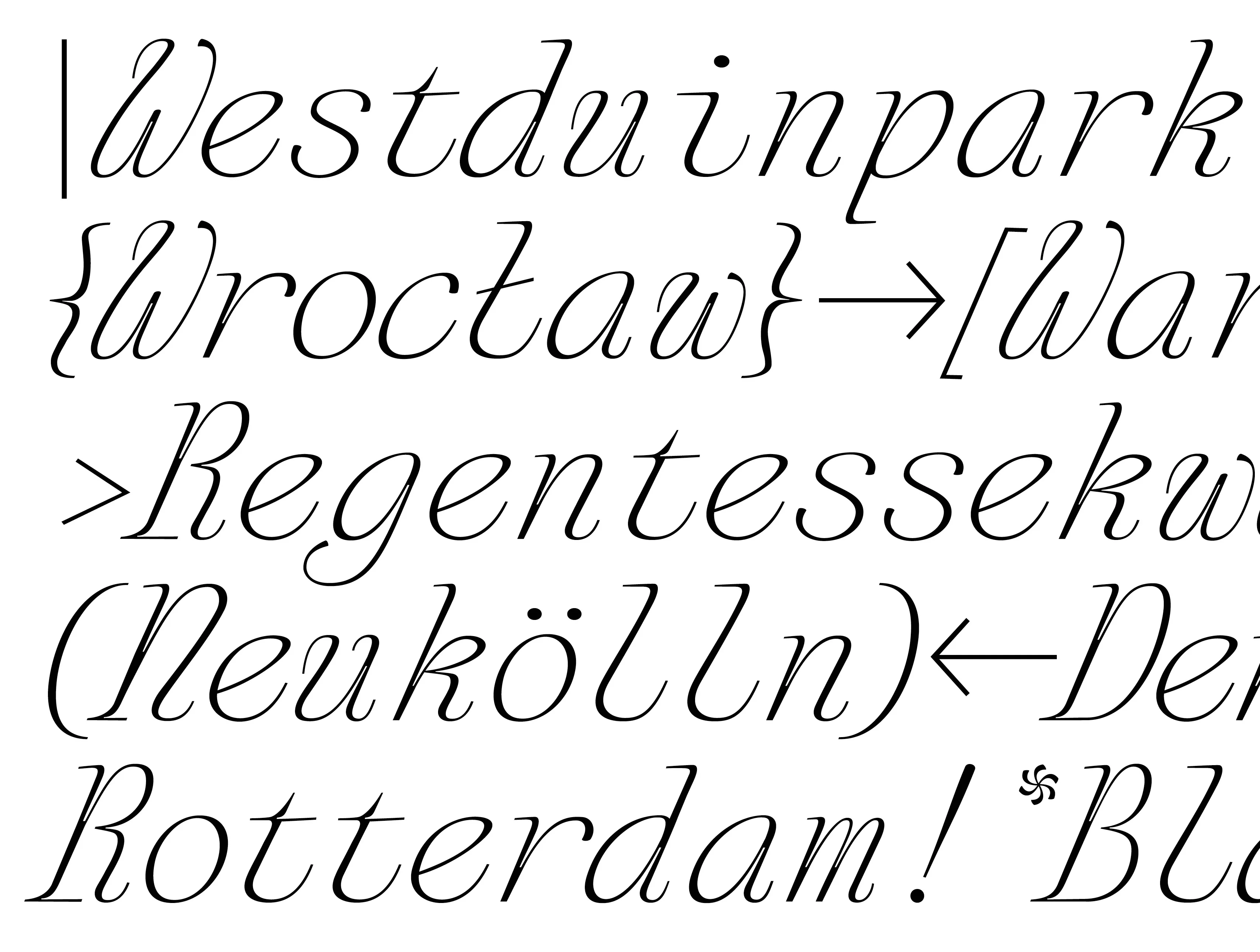
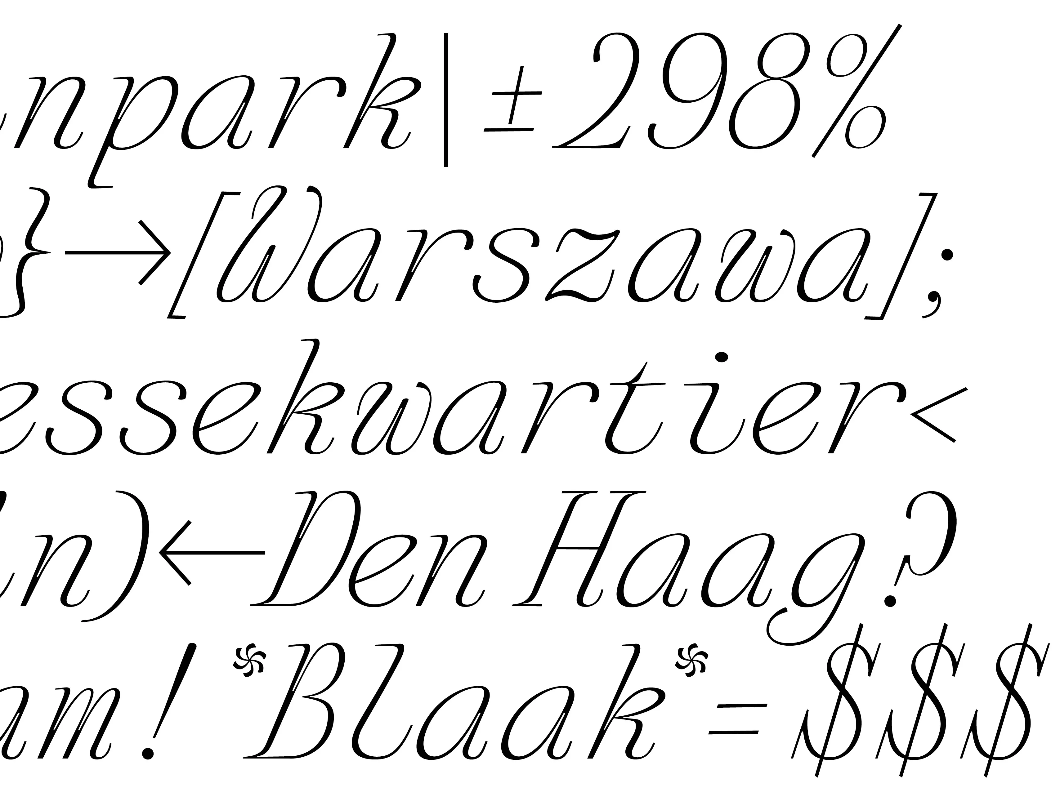
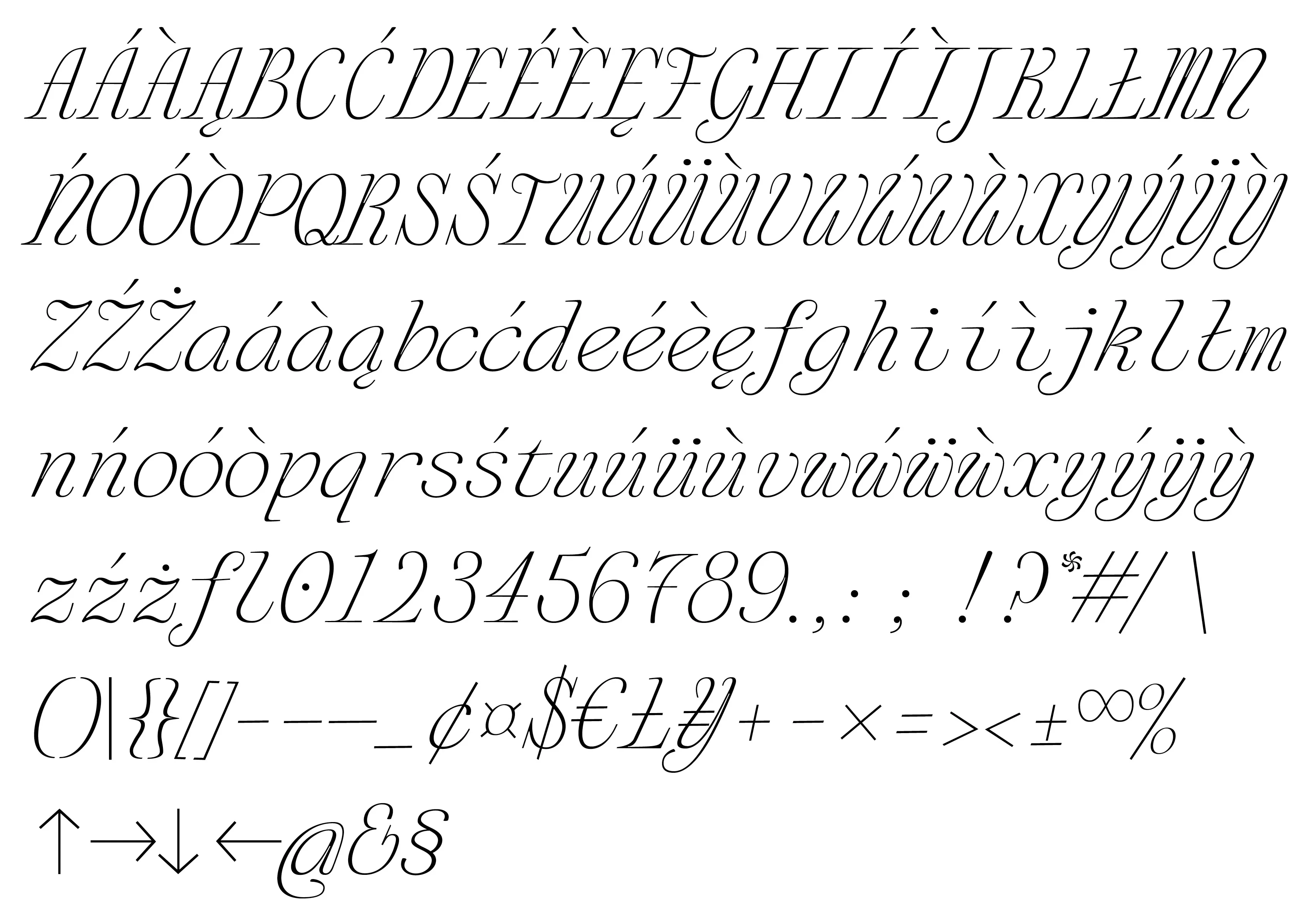
As for the italic part, we took loose inspiration from the script typefaces we found in reproduced type specimens of the Dutch classic, the office of Johannes Enschedé & Sons.
Initially we drew each letter as monospaced (i.e. each letter had the same width). After the design of each glyph was more or less set, we then adjusted the sidebearing spaces of the letters in proportion to their shapes, breaking the strict mono requirement. Thanks to this, we ended up with unusual letterforms, but without the usual “holes” one might see in a true monospaced font.
Minty’s vines grew out from two design challenges that interested us, which we eventually morphed into one typeface concept: How would you design a typeface that started as an italic? & What design qualities can a monospaced typeface bring?
As for the italic part, we took loose inspiration from the script typefaces we found in reproduced type specimens of the Dutch classic, the office of Johannes Enschedé & Sons.
Initially we drew each letter as monospaced (i.e. each letter had the same width). After the design of each glyph was more or less set, we then adjusted the sidebearing spaces of the letters in proportion to their shapes, breaking the strict mono requirement. Thanks to this, we ended up with unusual letterforms, but without the usual “holes” one might see in a true monospaced font.
MINTY
Italic typeface
2020
Italic typeface
2020
Typeface concept & design made together with Ocean Albin.